The world has been evolving rapidly, and so has the online world. Mobile devices have become more advanced, and people are using them more than ever. This is why it’s essential to have a mobile-friendly website.
The purpose of this article is to explain why having a mobile-friendly website is important. This will cover what “mobile friendly” means and explain how it impacts your users’ experience with your site. We’ll also look at some examples of sites that aren’t optimized for mobile viewing, as well as some tips on how you can optimize yours by choosing the right experienced SEO Company in Ahmedabad Read on for the full scoop…
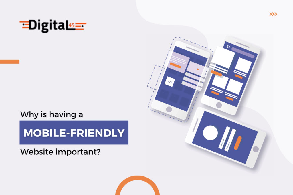
A Mobile-Friendly Website: What Exactly Is It?

A mobile-friendly website is one that displays well on a mobile device. It’s exactly what it sounds like: a website designed for the smaller screens of mobile devices such as phones or tablets. A mobile-friendly website has many benefits, including:
- Easier navigation: When you’re using a website on your phone, it’s often easier to navigate if the information is presented in an easy-to-digest way. This means things like clear headings, subheadings, bulleted lists, and other formatting tools that make it easier to read and understand
- Easy reading: A lot of people use their phones to read email, social media posts, and articles, so having those things on your site can help increase engagement (as long as they’re not too long)
- Easy use: Making sure your site works easily with touchscreens will help users who are browsing on their phones be able to interact with your pages without any difficulty or frustration.
Mobile-friendly websites are also more secure because they’re encrypted to protect sensitive information like passwords and credit card numbers. They’re also faster to load, which means you won’t have an impatient customer waiting for pages to load before they can navigate your site. Finally, they provide a better user experience overall.
Mobile-friendly websites are becoming increasingly important, and it’s not just because of the shift in how people use devices. It’s also because Google has been penalizing sites that aren’t mobile-friendly for a few years now, so if your website isn’t optimized for mobile use, you could be missing out on traffic from search engines. And with so many people using their phones to browse the web, it’s worth considering making sure your site is up to snuff.
Who Really Needs Mobile Visitors?
You may be wondering why mobile visitors are so important. After all, shouldn’t you just focus on the desktop? Well, the answer is yes and no. While it’s true that more people use their computers than smartphones, they will soon be more evenly split between desktop and mobile. Now let’s look at some compelling statistics about why having a mobile-friendly website matters:
Mobile users are also more likely to convert into customers because they can easily find what they want without having to keep zooming in and out of different screens or spend time figuring out how to navigate your site on a small screen with limited functionality (which can lead them back out again). A user’s experience is also much better when using one device versus two or three separate ones throughout their shopping process; this leads us to our next point.
Mobile users are more likely to spend more per order because they don’t have to open multiple tabs or windows on their desktop computer, which can lead to confusing navigation. A mobile-friendly website means that shoppers will stay focused on browsing for products instead of spending time trying to figure out how things work (which may lead them away from your site altogether). A user’s experience is also much better when using one device versus two or three separate ones throughout their shopping process; this leads us to our next point.
Mobile users are more likely to spend more per order because they don’t have to open multiple tabs or windows on their desktop computer, which can lead to confusing navigation. A mobile-friendly website means that shoppers will stay focused on browsing for products instead of spending time trying to figure out how things work (which may lead them away from your site altogether). A user’s experience is also much better when using one device versus two or three separate ones throughout their shopping process; this leads us
Mobile-friendly websites are becoming increasingly important, and it’s not just because of the shift in how people use devices. It’s also because Google has been penalizing sites that aren’t mobile-friendly for a few years now, so if your website isn’t optimized for mobile use you could be missing out on traffic from search engines. And with so many people using their phones to browse the web, it’s worth considering making sure your site is up to snuff.
A mobile-friendly website has several benefits.
You’ll notice a significant increase in brand visibility, traffic, conversions and sales.
Benefits of having a mobile-friendly website are:
Increased Visibility – Your website appears higher in searches when it’s optimized for mobile devices. This increases the chance of people finding you on their phone or tablet when looking for products or services like yours.
Increased Traffic – When people search for content on Google, their results are tailored based on location (within a certain radius). If someone does not find what they’re looking for at one business’ site, they may try another within that radius and see if it delivers better results.
With an optimized site that includes local listings as well as reviews from other customers who’ve had good experiences at your company’s physical location(s) plus those who’ve only interacted via phone/email or social media channels such as Facebook Messenger or Twitter DM conversations then there’s no reason why anyone should ever leave without knowing exactly what they need right now!
Conversion Rates – When people find what they’re looking for on your website, they’re more likely to buy from you.
Increased Sales – People who’ve found your business online are also less likely to purchase again because they’ve already experienced positive results with their products or services before making contact with it.
Mobile Friendly CMS – If there’s one thing that can make or break a website’s mobile experience, it’s the design of its content management system (CMS) like WordPress, which powers our next point
Mobile users are more likely to spend more per order because they don’t have to open multiple tabs or windows on their desktop computer, which can lead to confusing navigation. A mobile-friendly website means that shoppers will stay focused on browsing for products instead of spending time trying to figure out how things work (which may lead them away from your site altogether). A user’s experience is also much better when using one device versus two or three separate ones throughout their shopping process.
Increased visibility – the more people who are able to find your website, the better! This means having a mobile-friendly site that can be accessed on all devices, from smartphones and tablets to laptops.
Increased traffic – with increased visibility comes an increase in traffic as well as more visitors coming back time and again when they need something new because they know what’s available right away without having to search around or wait days (or even weeks!) before getting their order filled.
Mobile-Friendly Websites Are a Ranking Factor on Google
Google is using mobile website rankings as an indicator of how well your site performs, and it’s making it easier for users to find what they’re looking for. In fact, Google recently announced that from now on, the number of people visiting your website from a mobile device would be one of the factors considered when ranking websites in the search results. So if you want to improve your rankings and attract more visitors to your site—which is essential in today’s competitive marketplace—you need to think about whether or not your website is optimized for mobile devices.

That’s why it’s so important to build a mobile-friendly website. In the last few years, Google has been changing the way that it ranks websites, and it has been using mobile-friendly sites as a ranking factor since April 2015. Now that mobile devices have become so ubiquitous. People are spending more time on their phones than they are on their computers; Google is starting to use mobile-friendly sites as an indicator of how well your site performs. It’s making it easier for, they may try another within that radius and see if it delivers better results.
With an optimized site that includes local listings as well as reviews from other customers who’ve had good experiences at your company’s physical location(s) plus those who’ve only interacted via phone/email or social media channels such as Facebook Messenger or Twitter DM conversations then there’s no reason why anyone should ever leave without knowing exactly what they need right now! Conversion Rates – When people find what they’re looking for on
Google is looking at the total number of people who are visiting your website from mobile devices, and it’s also looking at how many of those visitors are actually interacting with your site. If you have a website that looks great on a desktop but is difficult to navigate on smaller screens — or if it just doesn’t render well when viewed through browsers like Opera Mini or Dolphin Browser — then chances are good that you won’t get as much traffic as you would if everything were optimized correctly with the right SEO Services in Ahmedabad.
You’re Spinning Money Around
If you’re not already on a mobile-friendly website, you’re throwing money away. Mobile-friendly websites are easier to navigate, more engaging, accessible from any device and location (like the gym), and more profitable. Plus, they provide post-purchase engagement opportunities with the ability to build an email list or ask for reviews. They also enhance brand credibility and are a great way to test products and ideas without spending a ton of cash (or time).
When was the last time you visited a website on your phone? If it wasn’t mobile-friendly, chances are pretty good that you didn’t stick around for very long. People have short attention spans (especially in today’s world) and will leave if they have to scroll through tiny text or wait for an image to load slowly. Mobile-friendly websites provide an experience that is easy to navigate from any device and location.
Users to find out what they’re looking for
In fact, Google recently announced that from now on, the number of people visiting your website from a mobile device would be one of the factors considered when ranking websites in the search results. So if you want to improve your rankings and attract more visitors to your site—which is essential in today’s competitive marketplace—you need to think about whether or not your website is optimized for mobile devices.
Mobile-friendly websites are easier to navigate and more engaging
They’re also more accessible (no matter what time it is) with post-purchase engagement options like live chat or click-to-call support. Plus, they help you reach a wider audience because users can search for products or services on their phones without having to be in front of their computers.
Mobile-friendly websites are more profitable and secure
With a mobile-friendly website, you can accept credit card payments from anywhere in the world—even if you don’t have access to a traditional payment terminal. Not only does this increase your sales, but it reduces fraud by allowing users to enter their own information safely and securely.
Shopping on mobile devices is dominating
Consumers are more and more likely to shop on their phones. Mobile shopping is on the rise, according to data compiled by eMarketer. In 2017 alone, consumers spent $2.8 billion they had previously saved on their mobile devices. And if you have a business website without a mobile-friendly design, it’s time to change that before your competitors do!

It’s easier than ever to buy things from your phone. Whether you’re shopping for groceries or clothes, it can all be done with a few clicks on your smartphone. But how does mobile shopping affect brick-and-mortar stores? According to the retail industry’s data, foot traffic has declined significantly over the past decade due to increased mobile usage.
Mobile shopping is the future. It’s more convenient, secure, personal and social than ever before, with trends showing that it will continue to grow in popularity as more people get smartphones and high-speed internet access.
It’s not only Millennials who are embracing mobile shopping. All demographics are increasingly taking advantage of technology, including men and women, young and old. And new data shows that students prefer to shop on their phones too. That’s good news for retailers because it means they won’t have to worry about losing these customers at all!
Take Action!
To take action, start by making sure your website is mobile-friendly. If you don’t have a website, get one! If you already have a website and it’s not mobile-friendly, fix it! Google is your friend here—just type in “Is my site mobile friendly?” and they’ll tell you how to make it so.
Once that’s done, make sure your site looks good on a mobile device and also makes sense to use with one hand. And finally: don’t forget to use Google Analytics or other tools to monitor how many people are coming through from mobile devices versus desktop computers.
Over half of all web traffic now comes from phones and tablets, which means that if you want to reach your audience with your website, it needs to be easy to navigate on these devices. And the best way? Make sure your site looks good on a mobile device and that it’s easy to use with one hand.
Once that’s done, don’t forget to use Google Analytics or other tools to monitor how many people are coming through from mobile devices versus desktop computers. If you’re only seeing traffic coming in via desktop computers, then it’s time for an update!
Conclusion
The importance of having a mobile-friendly website is that you can reach out to your customers on the go. This will help your business reach more customers and increase its sales. If you want to know more about this topic, contact the best SEO Company in Ahmedabad.
